Hi everyone!
Today I have something a little different for you! I became very aware recently (thanks to you guys!) that many of my photos are being used on Instagram and other photo sharing sites without any credit given to me and with my watermark cropped out. This saddens me greatly that anyone would purposefully crop out a watermark. So I set about making my photos less vulnerable.
You may remember that I used to add my watermark along the edge of my pinky, but since discovering how easy that is to crop out, I opted to make the change to the curved-around-the cuticle watermark.
Since doing that, I've received several emails asking how to create this type of watermark, and since it's extraordinarily hard to explain without visual aid, I decided to create a step-by-step tutorial to show you all how to do it! First there's a full picture tutorial and then I've also included a video that shows me going through all of the steps.
Note: I use the GIMP program, which is a free downloadable image manipulation program. I recently got Photoshop, but I'm so used to GIMP now that I haven't even tried using Photoshop for this.
Note 2: It's in your best interest to enlarge the photos to better see all the small details.
Note 3: This post is incredibly picture-heavy, so be prepared.
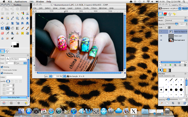
Note 4: Yes I have a leopard print desktop wallpaper. Are you even a little surprised?
Keep reading for the tutorial!
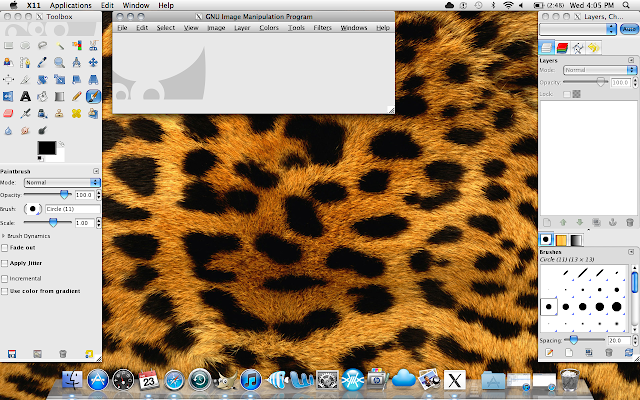
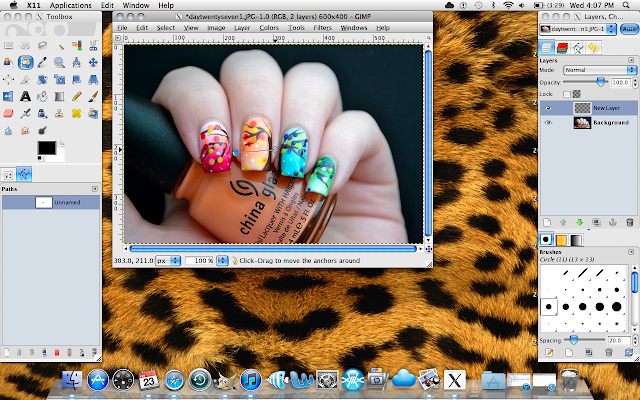
Step 1: Open GIMP. It has 3 main windows - the toolbox on the left side, the image window in the middle and the layers window on the right.
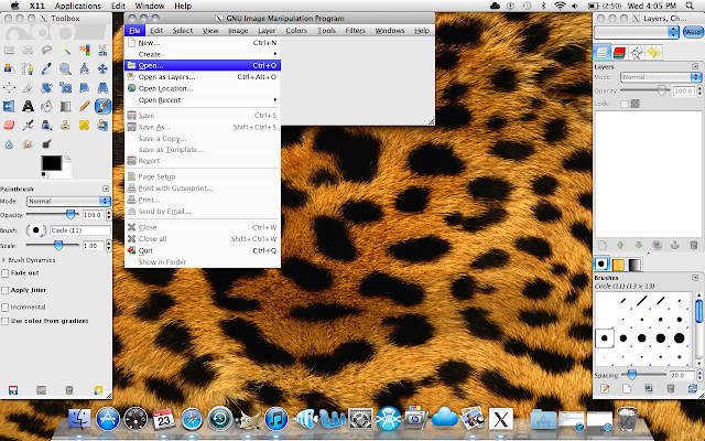
Step 2: Open the image you want to add your watermark to.
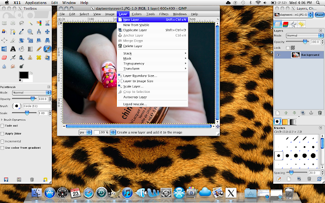
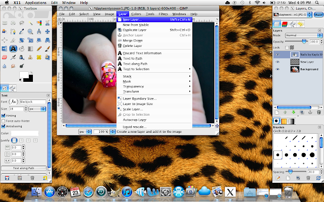
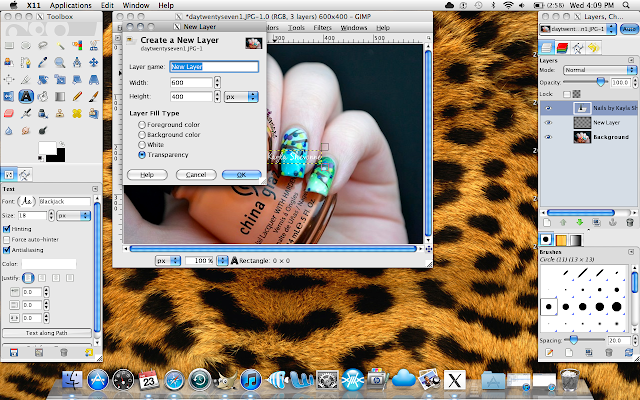
Step 3: Add a new layer to your image. To do this, go to the "Layer" menu and click on "New Layer". You'll then get a prompt with a few different options. The first is the name of the layer. You can change that if you want, but it's not at all necessary. Next is the size of the layer. The layer will automatically be the same size as your original image, so no need to change that either. The one thing you do need to make sure of is that you set the "Layer Fill Type" to "Transparency".
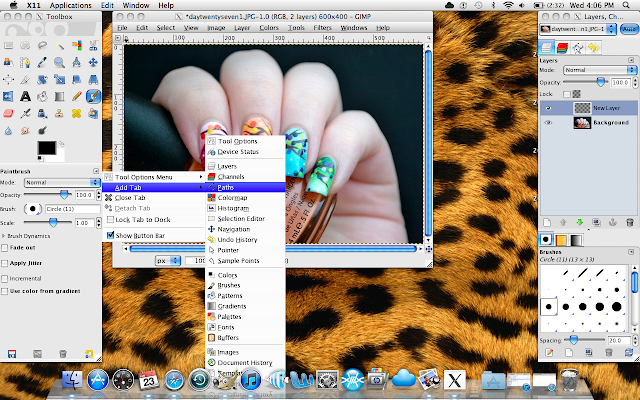
Step 4: Since we're going to be working with the paths tool, you'll want add the paths tab to your toolbox. To do this, click on the small arrow on the right side of the toolbox. Go to "Add Tab" and then select "Paths". Now you'll see that you have a blank paths tab that we'll work with later.
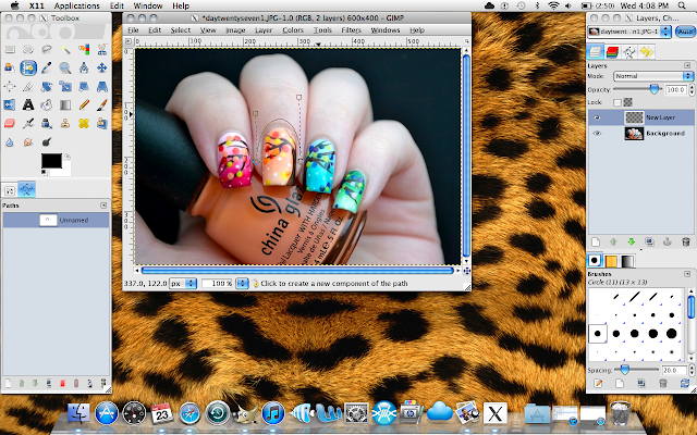
Step 5: Choose your paths tool from the toolbox. It's highlighted in blue in the above and below photos in case you're not sure which one it is. With this tool, you're going to create the curved path along which your text will appear. Click your starting point first and then your end point. Then take the line that those two points created and drag it to create a curve around your cuticle. You can use the anchors of the path to move and alter it until you're satisfied with the shape and position.
Step 6: Now you want to create the text that will become the watermark. Click on the the text tool in your toolbox and before doing anything, make sure that you're no longer in the paths tab of the toolbox. Next, go ahead and change the size, font style and colour to suit your tastes. Finally, click on any part of the image to create a text box. Important: it doesn't matter where you add the text at this step.
Step 7: Close your text box. Now in the very bottom of your toolbox, there's a button that says "Text Along Path". It's highlighted in blue in the below photo. Click that to place the text you just added to the curved path you created earlier. At first, the text will show up as a strange hollow purple colour, but don't worry, we'll fix that. You'll also notice that your original text still remains at this point. But again, we'll fix that later.
Step 8: In order to fill in the text with colour, you'll first want to create another layer just as you did before in Step 3. Go to the "Layer" menu, click "New Layer" and again ensure that the "Layer Fill Type" is set to "Transparency".
Step 9: Now we want to fill in that text so that it's the desired colour and no longer hollow. To do this, select the paint brush tool from the toolbox. Choose the biggest brush you can. You can see below that in the second photo, I changed both the size and scale of the brush to make sure it was fairly large.
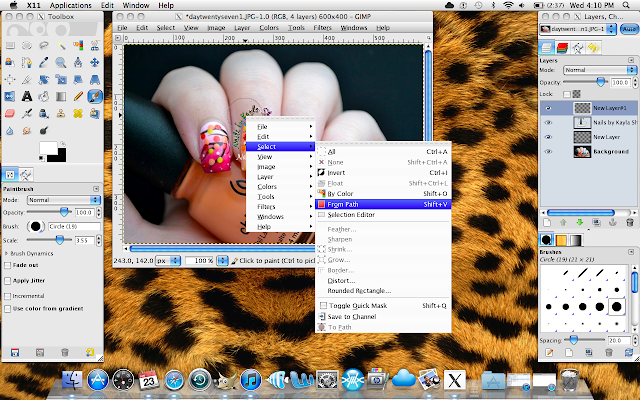
Step 10: Now, you want to right click on the text itself (the curved text, not the original that's still hanging around), choose "Select" and then "From Path". This will ensure that you only colour the text and nothing else on the image. When you do this, you'll see that the text is selected and looks sort of flashy around the edges.
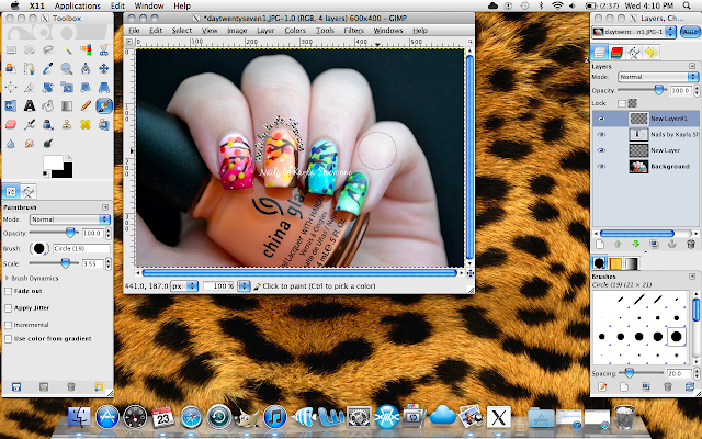
Step 11: Colour the text in with the brush. Since it's the only element selected, nothing else will be altered but the text.
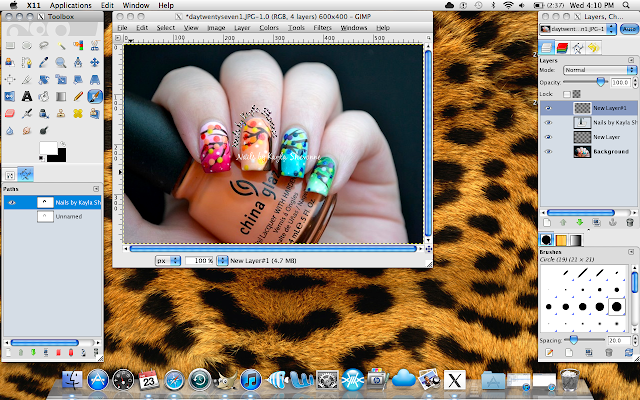
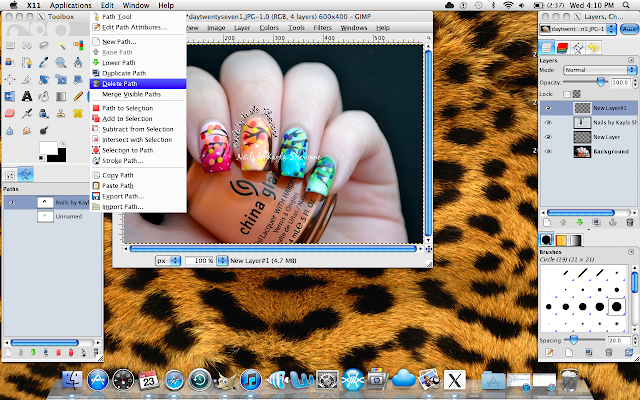
Step 12: Now it's coloured in, but it still looks pretty much the same. Not for long! Head over to your toolbox and click on the paths tab that we added earlier. There should now be two paths visible, one called "Unnamed" and another with the same name as your text (for me it's "Nails by Kayla Shevonne"). You want to right click on the latter one and delete it.
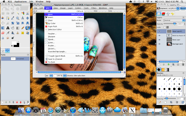
Step 13: Once you've deleted that path, you'll notice that your text is still flashy. That's easy enough to fix. Simply go to the "Select" menu in the image window and scroll down to "None".
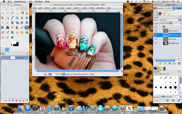
Step 14: Now you can see your text! It's really starting to come together now. So next you want to get rid of that original text that's in the way. Head over to the Layers window on the right hand side and find that text layer. It will be named the same thing as the text (again, for me it's "Nails by Kayla Shevonne"). Right click on that layer and delete it.
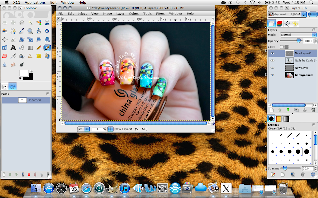
Step 15: Now all you're left with is your watermark. If it's to your liking, you can reduce the opacity of it in the Layers window by simply moving the arrow on the "Opacity" bar to another percentage (as you can see, it's at 100% opacity right now). I usually change mine to somewhere between 60% and 75%, just depending on the photo. For this one in particular, I changed the opacity to 75%.
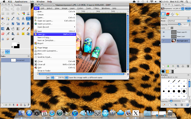
Step 16: And there you go! Your curved text watermark! Just remember to save your new photo!
I know that this seems like a lot of steps, but once you get the hang of it, it becomes an automatic process that doesn't take very long at all.
As promised, I've also included an accompanying video.
VERY IMPORTANT: watch the video in HD because otherwise the text might look a little blurry on your screen.
If you watch the video, you'll see that the above statement about this really not taking that long is very true indeed! The video is a live screen recording and you can actually see the time on my laptop. You'll see that the video starts at 7:33pm and ends at 7:34, after I've completed all of the steps above. So once you get the hang of it, it's super quick and easy!
I've also included a Troubleshooting Guide in case you run into any problems. I could only think of one problem that you might have, but if you have any other issues as you're going about this, leave me a comment below and I'll add them and their solutions to this troubleshooting list.
Troubleshooting Guide:
Problem: You got a big line shooting across your photo once you hit the "Text Along Path" button. It looks something like this:
How to fix it: No worries, it just means that your text is too long to fit along the path you created. Simply undo the steps you've already done and make your text size a little smaller so that the text fits along the path. Alternatively, if you like the font size you chose, just make your path longer. Once you understand what size path and text work the best for your personal watermark, you'll rarely ever have this problem again.
Problem: Your text is really wide and not snug along the path you created. It looks something like this:
How to fix it: This just means that when you created your text box, you created it too large. In GIMP, there's actually no need to create a text box. Instead, once you've selected the text tool, you can just click anywhere on the picture and start typing. The size of your text determines the size of the box and it automatically adjusts itself. So don't actually create a square text box to type in and your problem will be solved.
_________________________________________________________________________________________________
I hope this tutorial has been helpful! Honestly, if this tutorial helps to stop even just one photo from going uncredited, it was more than worth the time that went into it. :)
